Welcome!

Welcome!
Please also visit following blogs:
- 'EMS Awareness' Blog

Academic comments are invited.

Encouragement Support - National Centre for Quality Management. Please become a member of NCQM.

Keshav Ram Singhal

Various information, quotes, data, figures used in this blog are the result of collection from various sources, such as newspapers, books, magazines, websites, authors, speakers etc. Unfortunately, sources are not always noted. The editor of this blog thanks all such sources.

People from more than 145 countries/economies have visited this blog: Afghanistan, Albania, Algeria, Angola, Argentina, Aruba, Australia, Austria, Azerbaijan, Bahrain, Bangladesh, Belarus, Belgium, Belize, Benin, Bhutan, Bosnia and Herzegovina, Botswana, Brazil, Brunei, Bulgaria, Burundi, Cameroon, Cambodia, Canada, Chile, China, Colombia, Costa Rica, Croatia, Cyprus, Czech Republic, Denmark, Dominican Republic, Ecuador, Egypt, El Salvador, Estonia, Ethiopia, European Union, Fiji, Finland, France, Georgia, Germany, Ghana, Gibraltar, Greece, Guatemala, Guyana, Haiti, Honduras, Hong Kong S. A. R. (China), Hungary, Iceland, India, Indonesia, Iraq, Ireland, Israel, Italy, Ivory Coast, Jamaica, Japan, Jersey, Jordan, Kazakhstan, Kenya, Kuwait, Laos, Latvia, Lebanon, Lesotho, Libya, Lithuania, Luxembourg, Macao S. A. R. (China), Macedonia, Malawi, Malaysia, Maldives, Malta, Manila, Mauritius, Mexico, Moldova, Mongolia, Montenegro, Morocco, Mozambique, Myanmar, Namibia, Nepal, Netherlands, New Zealand, Nigeria, Niue, Norway, Oman, Pakistan, Palestinian Territory, Panama, Papua New Guinea, Peru, Philippines, Poland, Portugal, Puerto Rico, Qatar, Rwanda, Romania, Russia, Saint Lucia, Samoa, Saudi Arabia, Saint Kitts and Navis, Serbia, Seychelles, Singapore, Slovakia, Slovenia, Somalia, South Africa, South Korea, Spain, Sri Lanka, Sudan, Swaziland, Sweden, Switzerland, Syria, Taiwan, Tanzania, Thailand, Trinidad and Tobago, Tunisia, Turkey, Turks and Caicos Islands, UAE, Uganda, UK, Ukraine, USA, Uzbekistan, Venezuela, Vietnam, Zambia, Zimbabwe etc. Total visitors number crossed 100,000 on 14. 02. 2013. Total visitors number crossed 145,000 on 30. 09. 2013. Total visitors > 200,000 (from 01.08.2014)

Thursday, February 2, 2012

PARETO CHART

Write-up – 8

Understanding Statistical Tools and Techniques

PARETO CHART


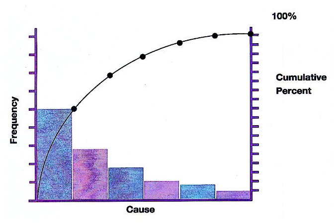
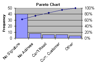
A pareto chart looks like a bar graph, but it contains both bars and a line graph. It is one of the basic tools of quality control. The length of the bars in the graph represents frequency or cost (time or money). These bars are arranged with longest bar on the left and shortest to the right. This is a tool which can be used to analyze the ideas from brainstorming session. This tool is also known as Pareto diagram or Pareto analysis. This tool is used to identify the vital few problems or causes of problems that have the greatest impact on the process. This chart pictorially represents data in the form of a ranked bar chart that shows the frequency of occurrence of items in descending order. The Pareto chart is named after Wilfried Fritz Pareto, an Italian engineer, sociologist, economist, political scientist and philosopher. He introduced the concept of Pareto efficiency.


It is significant to use Pareto chart:

- To analyze data about frequency of problems or causes of problems in a process
- To focus on the most significant problem or cause, when there are many problems or causes
- To analyze broad causes
- To communicate with others about the data


Following procedure will be useful to use Pareto chart and its analysis:

- Decide the categories of group items
- Decide approximate measurement (frequency, quantity, cost, or time)
- Decide the time period to gather data and use in the Pareto chart (one work cycle, one full day, or one week)
- Collect data, record and assemble data for the category each time
- Subtotal the measurements for each category
- Determine the appropriate scale for the measurements data collected
- Mark the scale on the left side of the chart
- Construct and label bars for each category by placing the tallest to the left, next tallest to its right and so on
- Calculate the percentage for each category
- Draw a right vertical axis and label it with percentage in a graph paper. Be sure that left measurement corresponds to one-half and it should be exactly opposite 50% on the right scale.
- Calculate and draw cumulative sums
- Add the subtotals for the first category and second category and place a dot above the second bar indicating the sum, then add subtotal of third category to the sum and place a dot above the third bar indicating the new sum and so on. Continue the adding subtotals and placing dots for all bars.
- Connect the dots, starting from the top of first bar. The last dot should reach 100 percent on the right side

In this way we can visualize the most important factors among a typically large set of factors through the Pareto chart. A Pareto chart often represents the most common sources of defects, the highest occurring type of defect, or the most frequent reasons for problems.

How you liked the write-up. Please post your comments. Thanks.

Wednesday, February 1, 2012

HISTOGRAM

Write-up – 7

Understanding Statistical Tools and Techniques

HISTOGRAM


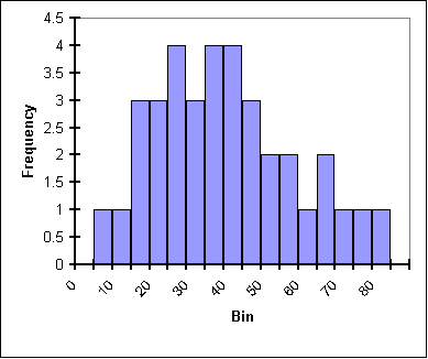
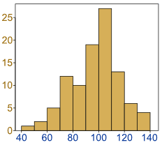
A histogram is a snapshot of variation or distribution, where data are grouped into cells and their frequency represented as bars. It is a commonly used graph to show frequency distribution. It looks like a bar chart, but it is different from the bar chart. We can put the data from the check sheets into a histogram. A histogram is a set of vertical bars whose areas are proportional to the frequency represented.

The histogram helps in analyzing the capability of a process. The variables being measured are shown along x-axis and the frequency occurrences of each measurement is charted along y-axis.


A histogram is convenient for large amounts of data particularly when the range is wide. It gives a picture of the extent of variation. It highlights unusual areas and indicates probability of particular values occurring. Histogram depicts the central tendency or mean of the data and its variation or spread.

A histogram is useful in showing characteristics of the process being measured, such as:

- Whether results of the process show a normal distribution – a bell curve?
- Whether the range of the data indicates that the process is capable of producing product as per defined specifications?
- How much improvement is necessary to meet specifications?


It is convenient to use histogram when data are numerical and we want to see the shape of data distribution to determine whether the output of a process shows normal distribution.

Following procedure will be useful:

- Decide a process to observe
- Collect at least 50 consecutive data points from the process
- Use histogram worksheet to set up histogram
- Draw x- and y-axes on the graph paper. Y-axes should be used mark and label for counting data values (frequency values) and x-axis to mark and label with variable values from the histogram worksheet.

For using histogram, we need to use histogram worksheet to set up the histogram on graph paper. Histogram worksheet helps in determining the number of bars, the range of numbers that go into each bar and labels for the bar edge.

How you liked the write-up. Please post your comments. Thanks.
CONTROL CHART

Write-up – 6

Understanding Statistical Tools and Techniques

CONTROL CHART


One of the key tools of Statistical Process Control (SPC) is a control chart. It is used to study and monitor a repetitive process, so that the process may remain in control.

Organizations use interrelated processes resulting output as a product. The outcome of a process is never exactly the same every time. Fluctuation or variability is an inevitable component of all processes or systems and it is expected. Fluctuation or variability arises naturally from the effects of miscellaneous chance events. If outcome of a process remains within the stable pattern, then we can say that the process is OK, but variation outside a stable pattern may be an indication that the process is not OK in a consistent manner. Event or outcome, finally beyond expected variability indicates that the process is out of control.


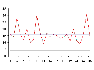
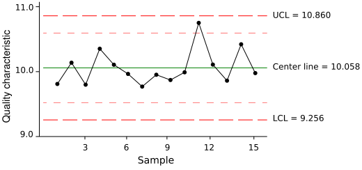
The control chart is a graph, which is used to show how a process changes over time. Data are plotted in time order. A control chart for a process has the following lines:

- A central line for the average
- An upper line for the upper control limit
- A lower line for the lower control limit

The values for the central line, upper line and lower line (i.e. control limits) are determined from historic data. These can be determined by computation based upon (i) the data covering past and current process records, (ii) statistical formulae whose reliability has been proved in practice. By comparing current data to these lines in the graph, one can come to the conclusion whether the process is in control or out of control. There are various types of control charts, divided in two groups – (i) Control chart for variables, and (ii) Control chart for attributes.


A control chart can be used:

- To control ongoing process by finding and correcting problems as they occur
- To predict the expected range of outcome from a process
- To determine whether a process is stable
- To analyze patterns of a process variations from special causes or common causes
- To determine whether improvement initiatives should aim to prevent specific problem or make changes to the process

Following procedure will be useful:

- Select the process that you wish to study, monitor or control
- Define the process control chart with average central line, upper control limit line and lower control limit line
- Determine the appropriate time period for collecting and plotting data
- Collect data and construct the control chart graph by plotting the data on the chart
- Analyze the graph, identify those signals which are ‘out-of-control’ on the chart and mark them on the graph
- Investigate the cause
- Document investigation process mentioning how investigated, what are the causes, what needs to be done to correct the ‘out-f-control’ situation

Standard control limits are located at 3-sigma away from the average or central line of the chart, known as 3-sigma limits. Control limits define a zone where observed data for a stable and consistent process occurs virtually all the time – 99.7%. Any fluctuations within these limits come from the common causes inherent to the process. Any fluctuations beyond the control limits results from a special cause that require fundamental change or improvement in the process. Any fluctuations beyond the control limits show that the process is out-of-control. When fluctuations are noticed beyond control limits then it is required to investigate and eliminate the special cause. Thus control chart can be used as a quality-monitoring tool.

How you liked the write-up. Please post your comments. Thanks.
Tuesday, January 31, 2012

CHECK SHEET

Write-up – 5

Understanding Statistical Tools and Techniques

CHECK SHEET


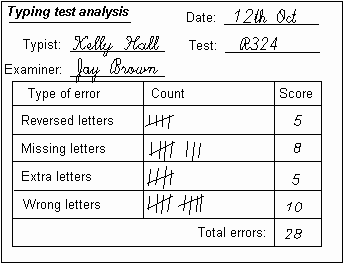
A check sheet is an organized way of collecting and structuring data. This is a generic tool that can be used for a wide variety of purposes. With the use of this tool, we can collect the facts in a most efficient way. Data is collected and ordered (organized) by adding tally or check marks against predetermined categories of items or measurements. A check sheet simplifies the task of analysis.


A check sheet should be used:
- When data can be observed and collected repeatedly by a particular person or at a particular place
- When collecting data relates to frequency or pattern of events, problems, defects, defect location, defect causes etc.
- When collecting data relates to a particular production process

Following procedure will be useful:
- Define the event or problem to be observed
- Develop operational definitions
- Decide the time and duration of data collection
- Design the check sheet form in such a way that data can be recorded simply by marking check marks or Xs or other similar symbols. The design of check sheet form should make use of input from those who will actually use the check sheet.
- On the fixed time and duration, collect and record data on the check sheet.


A check sheet should be developed in such a way that it is easy to understand. A check sheet is a simple chart for gathering data. When check sheet is designed clearly and cleanly, it assist in gathering accurate and pertinent data, and also allow person concern to read and use data easily.

A check sheet can be kept electronically.

How you liked the write-up. Please post your comments. Thanks.
CAUSE AND EFFECT DIAGRAM

Write-up – 4

Understanding Statistical Tools and Techniques

CAUSE AND EFFECT DIAGRAM


Kaoru Ishikawa developed this analysis tool in 1943. This diagram is also known as ‘Ishikawa diagram’ or ‘Fishbone diagram’.

The cause and effect diagram organizes and displays the relationship between different causes for the effect that is being examined. It is a useful tool for opening up thinking in problem solving. It identifies many possible causes for an effect or a problem. This tool can be used to structure a brainstorming session. In fact, the cause and effect diagram helps in organizing the brainstorming process in a systematic way. This is a tool that sorts ideas into different categories.


This tool should be used when you wish to identify possible causes for a problem. Following procedure will be useful:

- Identify the problem on which you wish to draw cause and effect diagram
- Write the problem at the centre right of the writing-board. Draw a box around it and draw a left-side horizontal line running to it.
- Brainstorm the main categories of causes, factors or concerns related to the problem. If you feel difficulty in grouping major categories, then it is better to use generic headings, such as Methods, Machine (equipment), People (human resource), Material, Measurement and Environment. These are commonly identified causes of problems.
- Write the categories of the causes, factors or concerns of the problem as the branches from the main row
- Brainstorm all the possible causes, factors or concerns of the problem. Ask – “Why?”
- Write the generated idea as a branch from the appropriate category. Possible causes, factors or concerns can be written in several places, if they relate to several categories. Example – No internal audit organized in the organization as the trained internal auditor resigned two months back. It can be written along People as well as along measurement.
- Again ask – “Why?” question about each cause. Continue asking – “Why? Why? Why?” and in this way you can generate deeper levels of causes, factors or concerns related to the problem.
- When you are unable to find more ideas, then focus your attention to the diagram where ideas are less.

Brainstorming can be effectively used to generate causes and sub-causes. When completed cause and effect diagram looks like a tree-like structure that indicates many factors including causes and concerns of a problem.

In this way you can now evaluate different causes, factors and concerns to solve a problem.

CAUSE AND EFFECT DIAGRAM WITH ADDITION OF CARDS

The process is similar as mentioned above, however, in the diagram at the cause side two different coloured cards are used to indicate facts in one colour card and ideas on other colour card. Generally facts are written on the left side of the cause spines, whereas ideas for solving the problem or effect are written on the right side of the cause spines. Ideas are then evaluated and selected to solve the problem or concern.

How you liked the write-up. Please post your comments. Thanks.
Monday, January 30, 2012

BRAINSTORMING

Write-up – 3

Understanding Statistical Tools and Techniques

BRAINSTORMING

Brainstorming is an effective group technique, which can be used to generate a large number of ideas quickly. The generated ideas can provide solutions to a specified problem in a variety of situations. In the process of brainstorming, members of the group are encouraged to put forward their ideas concerning the problem. All ideas generated in the group are recorded for subsequent analysis.

Brainstorming cartoon – Courtesy www.socialsignal.com


Brainstorming process may be described as under:
- Identify a problem
- Call a brainstorming meeting of a group
- Ask each member of the group to put forward their ideas
- Record all ideas
- Identify areas of improvements
- Design solutions to the identified problem
- Develop an action plan to execute designed solutions

Brainstorming is generally used in conjunction with the cause and effect diagram tool. The cause and effect diagram identifies many possible causes for an effect or a problem. It can be used to structure a brainstorming session.

Brainstorming Image - Courtesy - www.mindspower.com


If you wish to generate a good number of ideas, then as convener of the brainstorming session, you should encourage all participants of the group to put forward their ideas. You should not criticize or make any adverse comments during the session. You should record all ideas. An openness of the convener will be able to bring out hidden ideas during the brainstorming session. A lot of good information and a number of ideas can be discovered, if the brainstorming team is a diverse and have experience in the identified problem area.

How you liked the write-up. Please post your comments. Thanks.

Thanks for the sources of Image and cartoon.

Sunday, January 29, 2012

PROBLEM SOLVING APPROACH ‘DRIVE’

Write-up – 2
Understanding Statistical Tools and Techniques

PROBLEM SOLVING APPROACH ‘DRIVE’

‘DRIVE’ is a problem solving methodology. It is an approach to problem solving and analysis that can help an organization to improve its processes.


The full form of ‘DRIVE’ is ‘Define-Review-Identify-Verify-Execute’. Using this methodology requires following steps:

D – Define – You should define – (i) the scope of your problem, (ii) the success criteria measurements – including deliverables and success factors that you agree

R – Review – Review the current situation of the problem, understand the background of the problem, determine and collect information – performance data, problem areas, improvement options

I – Identify (determine) – Identify (determine) improvement options or solutions to the problem – What changes you need to improve your process so as to enable to rectify the problem

V- Verify – Verify (check) – Whether determined improvement options or solutions will bring those results that we defined as the success criteria measurements

E – Execute (implement) for solutions and improvement – Plan and execute improvement options or solutions, check the results.


We are a quoting a simple example using ‘DRIVE’ methodology. In a class, when result of first assessment test announced, the management was worried looking to the result that 50 percent students failed in Mathematics, while in other subject the result was 95 to 100 percent. The school management used the problem solving approach ‘DRIVE’.

Define – Scope of the problem – 50 percent students failed in Mathematics. Success criteria – 95 percent students should get good marks in Mathematics.

Review – Current situation – Students of the class are good in other subjects. They could not get good marks in Mathematics. Background – The mathematics teacher resigned in the month of July and the Mathematics class is taken by other subject teacher. There is a shortage of Mathematics subject teachers in the school. School requires three Mathematics subject teachers, while there are two only. Problem area – Recruitment process requires advertisement in local newspapers and then selection of qualified teacher. No action yet initiated. Improvement option – Immediate action to start recruitment process

Identify – Identify (determine) – the recruitment procedure with timeframe objective and also during the time gap outsource Mathematics teacher from other schools and also plan taking extra periods on Sunday with the help of two Mathematics teachers available in the school on payment of extra remuneration.

Verify – Verified shortage of teachers and found improvement options suitable to solving the problem.

Execute – The school management took immediate steps to contact nearby schools and one school agreed to depute their one Mathematics teacher for one month. Extra classes were organized on Sunday with the help of two teachers. Recruitment process started and within one month a new Mathematics teachers recruited.

Thus the school management is able to improve its processes by using a problem solving approach ‘DRIVE’.

How you liked the write-up. Please post your comments. Thanks.
Understanding Statistical Tools and Techniques

Write-up – 1

Understanding Statistical Tools and Techniques

Implementing an effective quality management system requires measurement, analysis and improvement. ISO 9001:2008 QMS Standard mentions requirements for analysis of data. There are a number of statistical tools and techniques available for monitoring, measuring, analyzing and improving the organization’s processes. We are starting a series of articles under the heading ‘Understanding Statistical Tools and Techniques’. Some of the tools and techniques are as under:

- Problem solving approach ‘DRIVE’
- Brainstorming
- Cause and effect diagram – CED – Fishbone diagram – Ishikawa diagram
- Cause and effect diagram with addition of cards – CEDAC
- Check sheet
- Control chart
- Histogram
- Pareto analysis
- Scatter diagram
- Stratification
- Process mapping
- Process flowcharting
- Force field analysis
- Bar chart
- Matrix analysis
- Tally chart


The use of statistical techniques helps organization in understanding variability. It helps organizations to solve problems. It also helps organization to improve effectiveness and efficiency. The statistical techniques also facilitate better use of available data to assist in decision making. Seven tools from the above are known as basic quality tools. These are:
- Cause and effect diagram – CED – Fishbone diagram – Ishikawa diagram
- Check sheet
- Control chart
- Histogram
- Pareto chart
- Scatter diagram
- Stratification

As per requirements of ISO 9001:2008 QMS Standard, an organization is required to determine, collect and analyze appropriate data. This must include data generated from relevant sources including as a result of monitoring and measurement. The analysis of data must provide information relating to:
- Customer satisfaction (See for reference clause 8.2.1 of the ISO 9001:2008 QMS Standard)
- Conformance to product requirements (See for reference clause 8.2.4 of the ISO 9001:2008 QMS Standard)
- Characteristics and trends of processes and products including opportunities for preventive action (See for reference clause 8.2.3 and 8.2.4 of the ISO 9001:2008 QMS Standard)
- Suppliers (See for reference clause 7.4 of the ISO 9001:2008 QMS Standard)


To improve organization’s processes by means of a systematic approach, people working in the organization require the knowledge of simple kit of tools and techniques. The person who actually works on the processes needs to understand these tools and techniques, so that he can effectively use these tools. Some may think that these tools are complex and require higher knowledge of Mathematics or Statistics. However, we will make the study of these tools and techniques in a language easy to understand. We request our readers to please send/post your comments and suggestions for improvement.

Saturday, January 28, 2012

Mutually Beneficial Supplier Relationship

The ISO 9001:2008 QMS standard is based on eight quality management principles and one of the principles is ‘mutually beneficial supplier relationship’. A supplier is a partner of an organization in its product realization. An organization and its suppliers are interdependent. A mutually beneficial relationship between the organization and its supplier enhances the ability to both to create value to each other.


Purchasing is an important activity under the product realization. The organization needs to ensure that purchased product conforms to specified purchase requirements. Accordingly, the organization needs to maintain control on the purchasing process, and thus it requires selection and ongoing review of supplier’s capabilities.


Implementing ISO 9001:2008 quality management system requires adoption of process approach and an organization is not able to improve its processes until the organization is able to get support from its supplier. As a result there is a necessity to improve organization-supplier relationship for mutual benefits.

An organization can take some steps to develop its suppliers. The organization can create partnership by encouraging its suppliers to become customer-focused. It can organize meetings with its suppliers to better communicate purchasing needs. The organization can motivate the supplier to move towards quality management system, if the supplier is not on this way. The organization can organize training for the staff of its suppliers to better communicate issues of meeting requirements and also to develop them.

It is for the organization to think how it can improve mutually supplier relationship and if the organization proactively acts in improving the relationship, the organization will be able to earn following benefits:
• Increased ability to create value for the organization and its suppliers
• Optimization of resources
• Long-term benefits

- DS & KRS

Friday, January 13, 2012

Do not be frustrated while implementing QMS


You are involved in the implementation process of ISO 9001:2008 QMS standard and you find that managers and employees in your organizations do not have the passion for quality and/or continual improvement. Such situations are generally observed and it may create frustration among people, who wish to implement quality management system in the organization with full zeal.


Don’t be frustrated with people’s behavior. Be positive. You may find some obstacles in the beginning. May be people around you are not sure of the returns. Your first priority is to create awareness among people about the system. Educate them. Explain how quality management system is useful to them as well as to the organization. It is observed that some organizations implement the ISO 9001:2008 QMS standard without making reasonable efforts for training people. Training of people is important. It should be treated as investment, not as an expense.


People won’t be interested in implementation of quality management system unless they know what it means to them and to their job.
- Explain why the quality management system is important to the organization.
- Explain how the quality management system will make their job easier.
- Explain what they will be required to do for implementing the system.

With best wishes,

DS&KRS